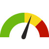
Indicator Gauge Icon Legend
Legend Colors
Red is bad, green is good, blue is not statistically different/neutral.
Compared to Distribution
 the value is in the best half of communities.
 the value is in the 2nd worst quarter of communities.
 the value is in the worst quarter of communities.
Compared to Target
 meets target;
  does not meet target.
Compared to a Single Value
 lower than the comparison value;
 higher than the comparison value;
 not statistically different from comparison value.
Trend

 non-significant change over time;
 significant change over time;
  no change over time.
Compared to Prior Value
 higher than the previous measurement period;
 lower than the previous measurement period;
 no statistically different change from previous measurement period.
 Significantly better than the overall value
 Significantly worse than the overall value
 No significant difference with the overall value
 No data on significance available
Premature Death
Measurement Period: 2019-2021
This indicator is archived and is no longer being updated. Click to learn more
This indicator shows the Years of Potential Life Lost before age 75 per 100,000 population.
Why is this important?
Years of Potential Life Lost (YPLL) is an estimate of premature mortality. It represents the number of years a person would have lived if he or she had not died before the predetermined age of 75 years. On a population level, the measurement gives more weight to deaths occurring among younger people and therefore YPLL is an alternative measure to death rates. When applied to different specific causes of death, YPLL can measure the relative impact of various diseases on the population and can be used to emphasize specific causes of death affecting younger age groups. YPLL is frequently used to quantify social and economic losses due to premature death.
5,705.0
years/ 100,000 population
Source:
County Health Rankings
Measurement period: 2019-2021
Maintained by: Conduent Healthy Communities Institute
Last update: April 2024
Measurement period: 2019-2021
Maintained by: Conduent Healthy Communities Institute
Last update: April 2024
Compared to

More details:
Original Source: National Center for Health Statistics - Natality and Mortality Files; Census Population Estimates Program
Graph Selections
Significantly better than the overall value
Significantly worse than the overall value
No significant difference with the overall value

Data Source
- County Health Rankings
Maintained By: Conduent Healthy Communities Institute (Methodology)
Filed under: Health / Mortality Data, Health Outcomes, Adults